Where are the abundant and reliable winds?

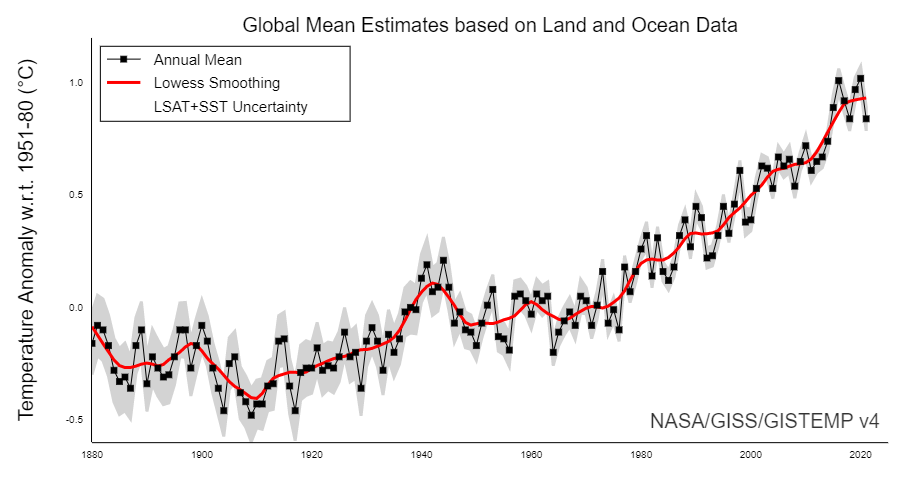
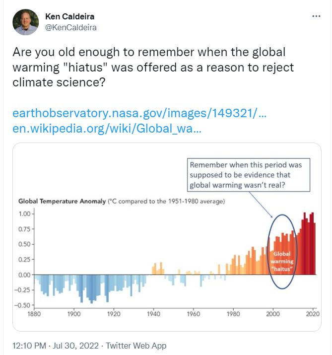
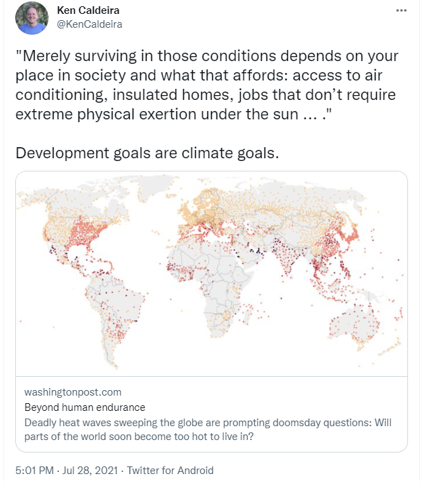
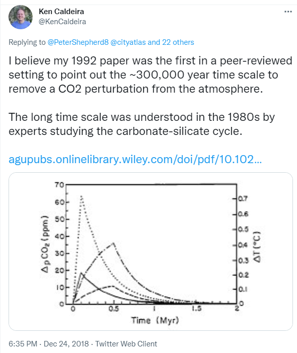
Northern Europe experienced a period of very low winds in 2021, adversely impacting Europe’s ability to generate climate-friendly electricity.

This led us to ask several questions:

— Is this level of variability in wind resources consistent with historical variability, or has this variability been increasing as a result of climate change?

— Where in the world are the winds most abundant and most reliable?

Antonini, E.G.A., Virgüez, E., Ashfaq, S. et al. Identification of reliable locations for wind power generation through a global analysis of wind droughts. Commun Earth Environ 5, 103 (2024). https://doi.org/10.1038/s43247-024-01260-7

Enrico Antonini, who was a postdoc in our group, set about answering these questions by analyzing historical reconstructions of weather since 1979. He led the production of a very nice paper published in “Nature family” journal “communications earth & environment“.

Abundant and reliable

We have all seen maps of average wind power at different locations, but where are winds both abundant and reliable?

Annual average global wind power from Antonini et al (2024).

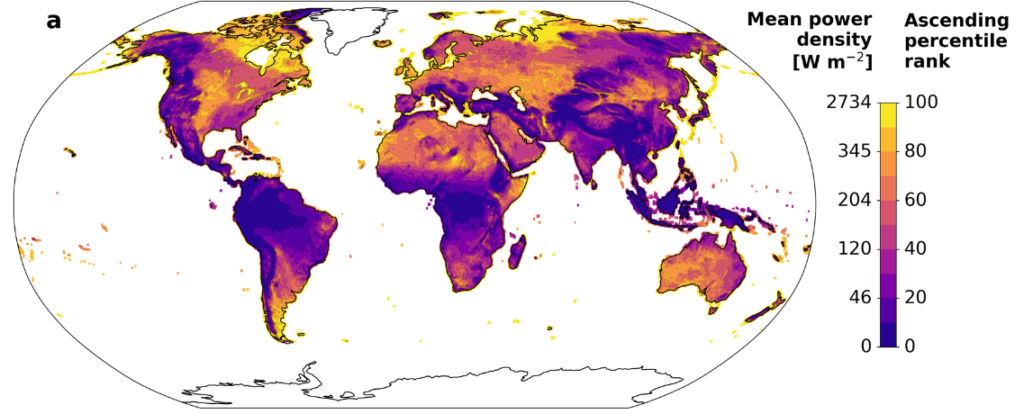
The areas in yellow above have strong winds, on average, whereas the areas in purplish colors have relatively weak winds.

Some places can have strong winds on average, but experience a large seasonal cycle. For example, some places have more wind in the winter and others and more wind in the summer. Enrico Antonini and colleagues developed the following map illustrating the magnitude of the seasonal cycle, indicating how much the average winds shown above vary from season to season. That map looks like this:

Seasonal variability of global wind power from Antonini et al (2024).

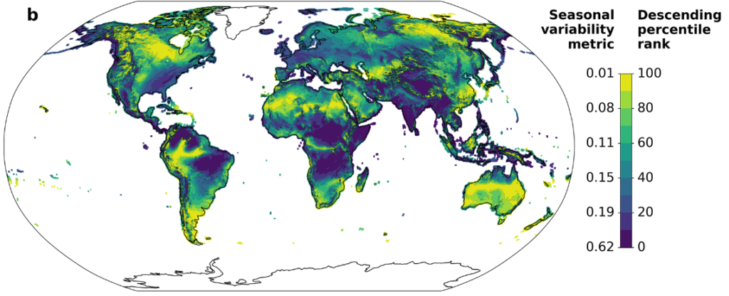
Details of the metric and methodology are explained in the paper, and some comments on the methods are offered below. Regardless, the areas in yellow above have winds that are relatively consistent from season to season, whereas the areas in blue exhibit a high degree of variation from season to season.

Some areas might have strong winds that are relatively consistent from season to season, but these areas might exhibit a large amount of weather variability. That is, due to weather variability, there could be weeks without much wind even if a season would typically be windy.

To estimate the degree of weather variability, Antonini and colleagues developed a metric of weather variability that indicated how much a typical year’s weather might depart from what you would expect on average. (Details in the paper, and some more discussion below.)

Weather variability of global wind power from Antonini et al (2024).

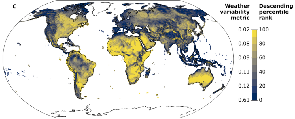
In the above figure, the yellow areas exhibit little weather variability, whereas in the dark area, the winds you actually get can differ markedly from what you would expect for that location and time of year.

Everyplace has its own particular needs, and certainly transmission and storage can be used to smooth out some variability in wind power production. Nevertheless, other things equal, one would like wind power that could provide a steady and reliable supply of electricity.

Now that we have maps of annual average wind power, seasonality of wind power, and weather variability in wind power, how do we combine these three metrics on a single map? Wind power is in units of power per square meter, whereas our variability metrics end up being in units of hours of storage that would be needed at mean demand levels. You can’t add together metrics with different units. You can multiply or divide them but that doesn’t make sense in this case.

We settled on the idea of percentile rank ordering each location from best (100th percentile) to worst (0th percentile) on each dimension, where best is highest mean power, lowest seasonal variability, and lowest weather variability. If someplace were the best on all of these metrics the minimum percentile ranking across the three metrics would be 100. If someplace were the worst on any of these metrics, the maximum across these three metrics would be zero. For someplace to have abundant and reliable winds (both with respect to seasonality and weather), the minimum percentile rankings should be high on all three metrics. We made a map based on this concept:

Places with abundant and reliable winds from Antonini et al (2024). Reds represent most abundant and reliable winds. Blue are least abundant or reliable winds.

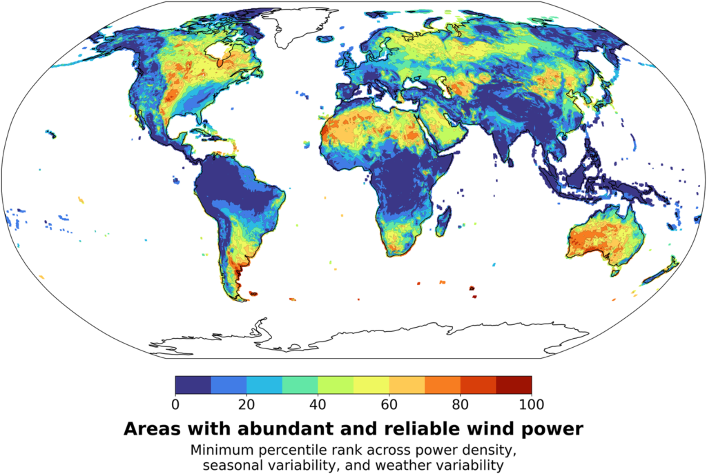
One thing that came out of this analysis is that parts of the American Midwest are among the places in the world with most abundant and reliable winds. There are other good places in Asia, in the Sahara and southern Africa, in Australia, and Argentina.

Obviously variants of this analysis could be performed making different assumptions about storage, transmission, variation in demand and so on. We hope others will perform these analyses.

Trends in abundance and reliability

One of the things that motivated this study was the deep wind drought in Northern Europe in 2021. Are these kinds of wind drought just a product of normal variability or is there an increasing trend in wind power or its reliability that might be associated with climate change?

Before we begin this discussion, it is probably a good idea to point out a few things:

1. It is possible that a trend is real and driven by real underlying physical causal factors, but the trend is masked by so much variability that the trend is not showing up as statistically significant on commonly used tests.

2. Even if there is a trend, the trend itself could be due to natural variability or any of a large number of causes. Further, there could be a climate-induced trend that is masked by natural variability of the opposite sign.

In short, our tests of statistical significance do not lead to any determinative claim for causality in any direction. Absence of evidence is not evidence of absence.

When we look for trends in annual mean wind speeds over the period from 1979 through 2022, we get a map that looks like this:

Trends in mean wind power from Antonini et al (2024). Reds represent stronger winds, blues represent weaker winds. Hatched lines indicate trends are not significant at the 0.05 level.

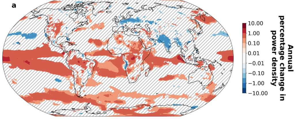
From the above figure we see that winds tend to be getting stronger in the equatorial region and in parts of the Southern Ocean. I am somewhat hesitant to ascribe too much significance to trends observed over land because we would expect 5% of the land area to show up as statistically significant at the 0.05 level just by chance. Nevertheless, there is an indication of a strengthening of winds in parts of the American Midwest and a weakening of wind over Northern Europe and India.

More investigation is needed to determine if these trends are real, and if so, whether climate change is an important causal factor.

Trends in weather variability in winds and wind drought severity from Antonini et al (2024).

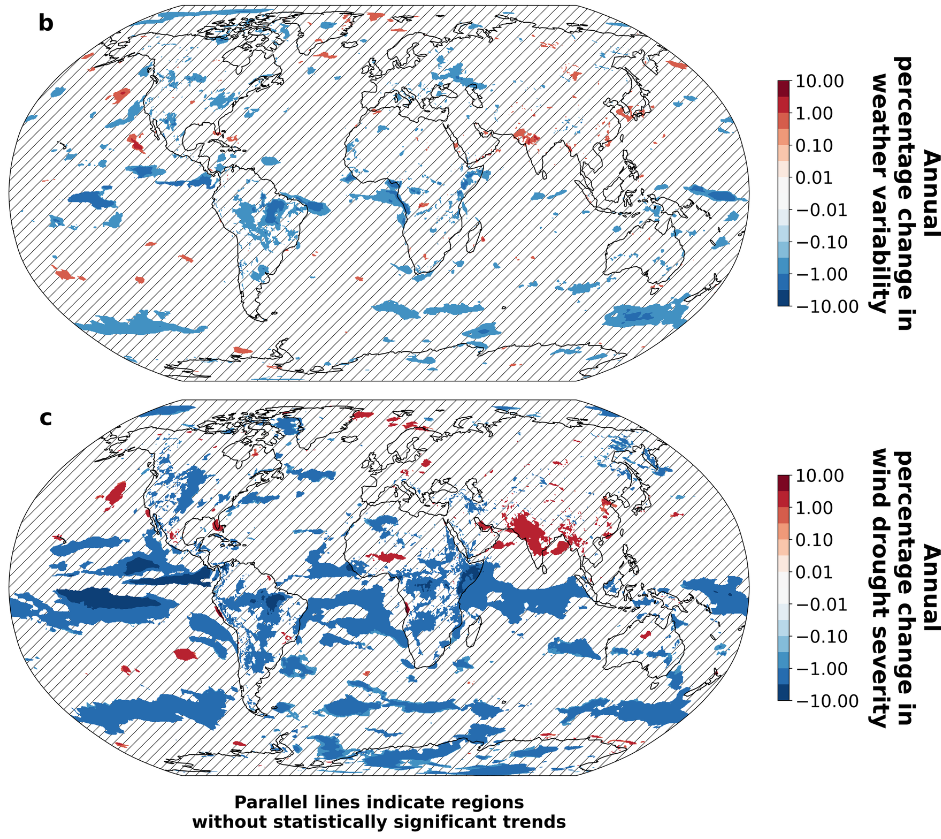
We found very little evidence of trends in weather variability in wind power. However, winds seem to be strengthening in the American Midwest and weakening over much of India. The result is that wind droughts, according to the metric we discuss below, are becoming less severe in the American Midwest and more severe over parts of India.

Energy metric of wind drought

There have been previous studies of wind drought (periods of low wind) that use arbitrary cut-offs of different sorts, such as how low the winds need to fall, or how long the low winds need to last, to be considered a wind drought.

Sometimes there can be an extended period of low winds that is interrupted by a single windy day or windy hour. Or there can be an extended period of relatively low winds but no time when the winds are extremely low. We wanted to develop a metric that could handle all of these cases in a consistent way.

We discuss wind droughts in terms of an energy deficit relative to some background case. For example, imagine we want to characterize the amplitude of the seasonal cycle in winds. We could ask: If we had this annual cycle repeating, how much energy storage would we need to yield a constant output of energy at the annual mean rate?

If the winds were steady, you would need no storage. If the winds were 8760 times the mean for 1 hour and then zero for the rest of the year, you would need an amount of storage nearly equal to the entire annual wind output. Intermediate cases would need intermediate amounts of storage.

To estimate weather variability relative to seasonal averages, we construct a year where wind power follows the typical average profile for different times of the year, and then we ask how much storage would be needed to offset weather variability and provide the amount of power from climatologically expected winds.

The figure below illustrates this methodology for a more realistic case, where the blue curve in panel a represents wind generation and the red curve represents the required output. When the blue curve is greater than the red curve, excess power is available and the power could be thought of as adding to storage. When the red curve is greater than the curve, that means the wind energy in insufficient to meet the target and so energy must come out of storage.

Note that the illustrated period of energy deficit is interrupted by a brief period of excess generation on Day 6. However, the amount of storage that would be needed to make up for the energy deficit would be the sum of the two areas where the red is above the blue from Day 3 to Day 10, less the excess generation that occurred on Day 6.

The amount of storage needed by calculating the difference in energy between each local minimum in the integral of generation minus target and the preceding global maximum in this integral (as illustrated in panel b).

Illustration of the process to calculate the energy deficit metric. Panel a shows a representative time period of 11 days with the actual wind power density time series (in blue) and the target climatological wind power time series (in red). In the same panel, we indicate regions of energy surplus and deficit. Panel b shows instead the integral of the energy surplus resulting from the difference between the actual and target generation. Our energy deficit metric is the largest energy deficit present in the generation balance integral over the period under consideration (in the panel indicated as A+C ̶ B). From the Supplementary Material to Antonini et al. (2024).

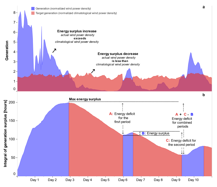
Details of this methodology are described in Antonini et al (2024) and the associated Supplemental Material. All codes, and high resolution versions of the figures shown here (and other figures) are available at the associated github repository.

Closing remarks

I am very much proud of this paper. I think Enrico Antonini did a fine job pulling all of this together. I also thank our co-authors who each helped in various ways.

In our group, we like to do geophysical studies that are relevant to energy systems. We chose steady power because we wanted this to be a geophysically-oriented study focused on basic principles and methodology. Our computer codes are publicly available and ready to be modified for specific applications.

It would have been easy for us to incorporate costs of turbines, and real electricity demand curves, and consider inefficiencies and costs of batteries and so on. Consideration of transmission would be a bit more challenging but could be done. However, a study like this that is purely geophysical will stand the test of time.

Studies that consider more things like real demand profiles, technical characteristics, and costs are very valuable, but will tend to age as these properties change over time. Studies could also consider mixes of wind and solar and perhaps other generation sources. We encourage others to do such studies. We may end up doing some of these studies ourselves.

Of course, we do not expect people to decide whether or not to build wind farms based on our study alone. However, we hope that our study provides incentive for people to look more carefully at the potential for wind power in areas that we have identified as having abundant and reliable wind resources.

The value of reducing the Green Premium

Lei Duan, Juan Moreno-Cruz and I recently published a paper in Environmental Research Letters, titled “The value of reducing the Green Premium: cost-saving innovation, emissions abatement, and climate goals”.

The Green Premium is the difference in cost between a technology that reduces net greenhouse gas emissions and the cost of the currently-used greenhouse gas-emitting technology.

The Abstract of this paper provides a good overall summary of what we did and our findings. In this blog post, I want to highlight a few things that we have found in doing this investigation.

An extract from a discussion between Ken Caldeira and Juan Moreno-Cruz after a talk for the University of Waterloo.

The COIN model

The idea for this model came in the discussion after I gave a talk for University of Waterloo on 3 Dec 2020. We wanted to have a model that was simpler than Nordhaus’s DICE model. We called it the COIN model, laughing that it was simpler than the DICE model — only two sides instead of six.

The COIN model is designed as a tool that can be used to explore conceptual issues, and to teach about climate change economics. It is not intended to produce numerically accurate results.

Among other simplifications, in the COIN model, the amount of warming is proportional to cumulative carbon emissions, climate damage is assumed to scale with the square of temperature change, population is held constant, and total factor productivity is assumed to increase exponentially with time.

For this paper, we added a second abatement technology to the COIN model with costs that followed an “experience curve” (also known as a “learning curve”). The optimizer was allowed to choose to invest in the new technology, even when it was more costly than the incumbent technology.

Stringency of carbon constraint

Sometimes people say things like, “We don’t have time to develop new technologies. We just have to deploy the technologies we already have.”

It is certainly true that we need to deploy the technologies that we already have, but it doesn’t follow from that that we should not put effort into developing new technologies or reducing the cost of existing technologies.

The idea that there is not enough time to develop new technologies or improve existing technologies is based on a mistaken notion. We can develop what does not exist while we deploy what does exist.

We found that the value of reducing the Green Premium increases with the stringency of carbon constraint. If we want to ramp down to zero net emissions by year 2050, there is even more value to reducing the Green Premium than if we were to, say, ramp down to zero net emissions by year 2100.

Rapidly decreasing emissions requires building a lot of costly infrastructure. Because of the way returns on investments and economic discounting works, you would need to invest more today to build something in year 2050 than you would to build the same thing in year 2100. If we have more ambitious climate goals, it becomes even more valuable to reduce technology costs.

Figure 3. Impact of cost-saving innovation on (a)–(c) simulated annual emissions, (d)–(f) abatement cost, and (g)–(i) total cost (abatement cost plus climate damages). Initial cost of the new abatement technology with learning is directly reduced to various levels while preserving the learning rate, which represents the impact of cost-saving innovations from research & development (R&D). In all three scenarios, lower initial technology costs reduce overall climate damages and costs of abatement efforts. Lower initial technology costs also incent more temporary emissions in earlier years as future carbon abatement becomes cheaper.

Costs don’t stop when we reach net-zero emissions

In Figure 3 (above), the middle row of panels is the cost of emissions abatement. Columns are different levels of abatement stringency. Note that the cost of mitigation abatement remains high in these simulations, even after all emissions are eliminated.

Sometimes people act like all of the cost of zero net emissions is in the transition to zero net emissions, but to maintain zero net emissions can also be costly if we do not have low-cost technologies available to help us avoid emissions.

One of the key benefits of reducing the Green Premium is to reduce costs after we have already achieved net zero emissions.

Figure S5. Simulated saving rates under No abatement, Unlimited budget, Large budget, and Small budget scenarios. The black line above is the savings rate in the absence of climate change mitigation (“no mitigation”). This is Figure S5 from the “Supplementary Data” from our paper.

Do investments in emission reduction come from current consumption or from other capital investment?

I didn’t know the answer to the title of this section. If investment in mitigation cannibalized other forms of capital investment this could slow economic growth, yielding knock-on costs to the economy.

A basic insight is that if you think the world is going to end tomorrow, there is little incentive to invest in the future.

However, in our model, investing in emissions reduction produces a better future, with less climate damage. This is especially true as the Green Premium is decreased.

Climate damage, and the cost of mitigation, can be thought of as akin to taxes, and expectation of lower future taxes provides an incentive for increased investment.

Thus, in our model, the capital for investment in mitigation comes from current consumption. In contrast, investment in other forms of capital (the “savings rate”) increases relative to the “no mitigation” case.

Figure 1. Diagram of the version of the COIN (Climate Optimized Investment) model used in this study. There are three state variables in this mode of the model: capital stock, cumulative carbon emissions, and cumulative emission abatement with a hypothetical new technology with a learning curve.

Learning subsidies

The COIN model uses an optimizer to determine the optimal partitioning of resources between consumption, capital investment, investment in abatement using the incumbent mitigation technologies (“COIN abatement”), and investment in abatement with a new technology with costs that decline following an “experience curve” (also known as a “learning curve”).

In Nordhaus’s DICE model, the marginal cost of abatement is equal to the marginal net-present-value of climate damage avoided. However, we find that in nearly all cases considered, the optimizer is willing to pay more for the new technology, because there is value in driving the new technology down the learning curve. This additional investment in the more costly technology is known as the “learning subsidy” (or “learning investment”).

We found it very interesting that the optimizer, in nearly all cases, was willing to pay a learning subsidy to help drive the new technology down the learning curve. This suggests that subsidies for new clean technologies can be an economically efficient way to produce a better future.

Summary

We have developed an extremely simple model, the COIN model, to investigate conceptual issues related to the economics of climate change mitigation in general, and the value of decreasing the Green Premium in particular.

We have found that there is substantial value in reducing the Green Premium, and the more stringent the climate goals, the greater the value of decreasing the Green Premium.

“Carbon-emitting technologies often cost less than carbon-emission-free alternatives; this difference in cost is known as the Green Premium.”

In our simulations, much of the value of developing cheaper abatement technologies accrued after net-zero targets were reached. Decreasing Green Premiums not only makes it easier to get to net-zero, it makes it cheaper to stay there.

In nearly every case considered, the optimizer chose to invest in a learning subsidy to bring down the cost of the new technology, even as it allocated substantial resources to deploy existing technologies. This suggests that it can be economically efficient to subsidize new technologies that are proceeding down a learning curve.

In our simulations, investment in emissions abatement induced higher rates of capital investment in other parts of the economy. Decreased costs of emissions abatement and climate damage are akin to expectations of lower future taxes, and expectations of lower future taxes, in an efficient economy, induce increased capital investment.

Lastly, I would like to close with a bit of homage to simple conceptual models. We do not pretend that our model provides reliable numerical results, but we do believe that our model provides conceptual insight that is applicable to the real world.

Reducing the Green Premium can contribute to achieving climate goals, and helps us to develop a better future.


Citation: Caldeira, K, Duan, L., and Moreno-Cruz, J. The value of reducing the Green Premium: cost-saving innovation, emissions abatement, and climate goals, Environ. Res. Lett. 18 104051 (2023)

Multi-decadal country-level regressions on GDP growth and temperature change

Over the past 50 years, the world has seen a substantial amount of global warming,

Global mean temperature change. https://data.giss.nasa.gov/gistemp/graphs_v4/

And there has been substantial regional variability in the rate of warming.

Temperature change over the past 50 years. https://data.giss.nasa.gov/gistemp/maps/

The world has also seen a lot of GDP growth, with substantial regional variation in the rate of GDP growth.

These observations led us (Lei Duan and myself) to ask whether there was a statistically significant relationship between country-level rates of warming and rates of GDP growth over the past half century.

We used country-level temperature change data from Berkeley Earth, kindly provided to us by Zeke Hausfather. We used GDP data in 2015 USD from the World Bank. For population, we used data from NASA’s SEDAC. We focus on the 50-year time period from 1971 to 2020, and include only countries that had data for the full 50 years. We performed country-level linear regressions, weighting countries in three different ways: (1) countries weighted equally; (2) countries weighted by GDP; and (3) countries weighted by population.

For each country, we estimated an average rate of temperature increase with a ordinary least-squares regression of country-level annual mean temperature versus time; estimated an average continuous rate of GDP increase with an ordinary least-squares regression of the logarithm of country-level annual GDP versus time. We report results for temperature increase in units of K/yr and for GDP growth rates in units of %/yr.

If for each country, we divide the GDP growth rate trend by the temperature rate trend, we get a slope in units of %GDP/yr per K/yr or, equivalently, %GDP/K. The histograms for the country level warming rates, GDP growth rates, and ratios of GDP growth to rates of warming looks like this:

Histogram showing the distribution of mean warming rates, GDP growth rates, and the ratios of these two rates. The top row weighs each country equally; the second row weighs countries by GDP; the third row weighs countries by populations.

The simple point of the above figure is to illustrate that every country has experienced a warming trend over the past half century, and every country has experienced positive GDP growth.

The ratio of GDP growth to warming rate has therefore been positive in every country. This is a reminder that there are many factors that influence GDP growth. Temperature increases may have slowed GDP growth in many countries but climate change has not been the primary determinant of GDP growth.

To investigate whether, on the half-century scale, there are robust relationships between country-level rates of warming and country-level rates of GDP growth, we performed linear regressions of each country’s GDP growth rate against its rate of warming, with those rates determined as described above.

Because countries are not normally distributed in their properties, we estimated uncertainties in the regression by using a bootstrap approach — doing 2,000 regressions sampling from our data by choosing countries for randomly from the set of complete countries, with replacement.

Our primary results are displayed in this figure:

Regression of GDP growth rate against rate of temperature change. The solid line is the regression on the raw data. The shaded area is the area that incudes 95% of the bootstrap simulations drawing on countries randomly with replacement.

Note that a horizontal line would be consistent with the 95% uncertainty range for all three country weightings. Our conclusion from this preliminary analysis was that there are too many other things affecting country-level GDP growth over the past 50 years for a climate signal to show up strongly in a global regression on annual-mean country-level temperature and GDP data.

The next thing we did was to look at whether there were differential impacts based on the GDP of the countries, so we stratified countries into three income groups with approximately equal number of countries in each group. There may be some indication of negative climate impact on GDP growth in the low- and high-income countries, but not at a level that would permit publication in a high-quality journal.

Regressions of GDP against temperature for high, middle, and low income countries, with countries weighted equally, by GDP, or by population.

Regressions in the low-income countries are strongly influenced by India, which experienced both relatively modest warming and relatively high rates of GDP growth. Regressions in the middle-income countries are strongly influenced by China, which experienced both substantial warming and very high rates of GDP growth.

Some climate damage functions predict net benefits of global warming for cold countries and net harm for warm countries. Therefore, we did an analysis partitioning countries into three groups based on mean country-level temperature. The result of those regressions appear in the next figure:

Regressions of GDP growth against temperature for low, middle and high temperature countries, with countries weighted equally, by GDP, or by population.

Again, we do not see strong trends. One might project that warming would have the strongest negative influence in the highest-temperature countries, but no strong signal emerges from this data. The signal of climate damage, if it is there, appears to be overwhelmed by other factors that influence rates of GDP growth.

We understand that there are many things we could have done to try to account for other sources of variability with the aim of isolating the effects of climate change as a residual. However, after consideration, we decided this was not a good application of our time.

It is possible that future climate change might produce a large amount of damage even if historical climate change did not cause a lot of damage. (It should be noted that there are a number of studies identifying historical climate damage, for example Callahan and Mankin [2022].) Many so-called “climate damage functions” do not show substantial climate damage below 1 C of warming but then show substantial climate damage at higher warming levels.

We thought about preparing this analysis for peer-reviewed publication, but the basic conclusion is that there are many factors that affect GDP growth, and that without considering those factors it is difficult to discern a signal of multi-decadal warming trends on multi-decadal GDP growth .

In closing, I would like to remind people that I have spent most of my professional life working on better understanding climate change and helping to facilitate a transition to a global economy that does not rely on using the atmosphere and oceans as waste dumps for our CO2 pollution.

Our analysis comparing half-century trends in temperature change with half-century trends in GDP growth for the period 1971-2020 did not provide strong evidence for a relationship between these two parameters. However, our uncertainty range is so large that our analysis does not serve to exclude a very strong historical relationship between temperature change and GDP growth. Our failure to provide compelling evidence for this relationship is not evidence that this relationship does not exist.

NOTE: The calculations and figures presented here were done by Lei Duan, working interactively with me.

ALSO NOTE: Others, including Richard Newell and colleagues, have done more sophisticated analyses addressing this issue.

A ban on solar-geoengineering research?

A colleague asked me about whether I would sign on to an effort that would effectively ban most research on solar geoengineering. Here is a lightly edited response.

A few points:

1. The main problem with this letter is that it is an assault on freedom of research that is in-itself benign. 

I don’t see that banning outdoor research on solar geoengineering is different in kind from the Catholic Church banning Galileo from dropping balls off the leaning tower of Pisa.

There should be a presumption that if an experiment is expected to lead to negligible direct harm, that the experiment can go forward unless it would lead to an expectation of imminent harm that could not easily be averted by other means.

2. I am increasing critical about people signing onto policy positions where it is not entirely clear whether the person has special expertise related to the issues contained therein.

If I sign a letter saying Trump should be prosecuted for his crimes, nobody will think that I have special insights into Trump’s crimes or appropriate legal processes.

But if I sign onto a letter like this, a reader might reasonably assume that I have special expertise on policy measures that would lead to international risk reduction. In fact, I have no such expertise.

I try to avoid signing anything that is in this grey zone, where it would not be clear to readers whether I was signing as a domain-area expert or merely as a concerned citizen with no special expertise.

3. As a matter of public policy, a no first use ban may or may not be effective at banning first use. I am not expert in the efficacy of such bans.

We can see how successful various international constraints were at stopping Russia from taking Crimea. Maybe having countries declare that they won’t do bad things helps to prevent bad things from happening, but maybe not. 

Were it clear that I was signing as a citizen, and not as someone with special expertise, I would sign onto a “no first use” ban.

4. As a practical matter, defining what is or is not solar geoengineering research will be very difficult as the definitions are based on establishing intent. 

Bad actors can still go ahead and study stratospheric chemistry, aerosol distribution techniques, effects of changes in diffuse radiation on ecosystems, climate effects of stratospheric aerosol loading, etc. They just need to do this without the intent of producing a system that would geoengineer the planet.

These sorts of bans will stop good actors and force bad actors to be less forthcoming about intent.

I recall with the iron fertilization experiments, many of the scientists could care less about iron fertilization as a climate mitigation tool, but they just saw the experiments as a chance to learn more about how marine ecosystems respond to nutrient additions. I think we can assume there are stratospheric chemists who might feel the same way about stratospheric aerosol release experiments.  

Politicians can fund these programs thinking of solar-geo as the use case with the scientists engaged in the study as pure science.

How are such cases to be adjudicated?  What are the proposed procedures if you do an experiment and I think your intent is really to learn about solar geoengineering? Do I take my charges to some sort of inquisition so that they can determine what is truly in your heart of hearts?

https://www.nature.com/articles/nclimate2036

Thought, action and social-system models

I was asked by a journalist to comment on a paper. Here is an edited form of part of my response.

Thought evolved over evolutionary time to mediate between sensory perception and muscular action. Models are tools for thought, and help us to mediate between our perceptions and our actions.

Models are like crutches that allow our thinking to advance where it might otherwise be hobbled.

It would seem that recommendations of what sorts of modeling should be done should start with a discussion of what actions we are considering and what tools might be most helpful for informing decisions related to those actions, and then proceed to a discussion of the feasibility and resources needed to construct a model that could usefully inform decisions.

This question is particularly problematic when it comes to models involving social systems.

Clearly, there is some predictability to social systems: We can reliably predict that if political leaders engage in racially or religiously discriminatory speech that there will be an uptick in racial or religious violence within the society.

On the other hand, our primary goal is to inform decisions, not predict those decisions. We do not necessarily want to predict whether political leaders will engage in racially or religiously discriminatory speech, but rather inform the political leaders of the likely outcomes of their actions.

Further, while there is some predictive skill in predicting that increased prices will have a negative influence on demand, for example, the evidence of predictive skill for what we might call “future history” is limited at best.

There remains a major challenge in thinking through what sorts of models of social systems at global scale can usefully improve understanding and decision making at a cost that is commensurate with the value of generated information.

https://royalsocietypublishing.org/doi/10.1098/rstb.1986.0056

Consumption value and asset value

Much of my work gets done by way of “productive procrastination”, that is, working on things other than what I “should” be working on. This in an example.

There have been differences of opinion about how best to address the question of temporal discounting, especially with respect to intergenerational equity and the climate problem. In its simplest form, this question is often framed:

How should we be valuing the future?

Lately, I have been taking a different tack on addressing this question, asking :

Why do we value the future as much as we do, and not more and not less?

One way of thinking about the discounting question is to ask: What is the relative value of consuming a thing versus owning a thing? How do we compare the consumption value of a thing versus asset value of a thing?

I have been working on a simple mathematical model to explore these issues, as a kind of “fiction science” – a make-believe world that I hope shares properties with the real world, to function as a mathematical metaphor.

From working with this model, I have convinced myself that we value the future as we do because organisms that valued the future (or at least, valued having an asset more than they valued consuming it) increased their evolutionary fitness.

The squirrel that buried the acorn was more likely to survive and successfully reproduce than the squirrel that didn’t bury the acorn.

The psychology of valuing the future is a product of an evolutionary process that tends to increase reproductive success and evolutionary fitness.

Paul Cezanne, Bridge across the Marne at Creteil, 1894

In an earlier version of my model, the agents hoarded assets until they had sufficient assets to achieve reproductive success. This led me to ask a question that I had never thought of before:

Why do we value current consumption as much as we do, and not more and not less?

If we are comparing consumption value versus asset value of a thing, we need to ask not only why we value the asset as much as we do, but also why we value consumption as much as we do.

And I think the understanding of consumption value largely parallels the understanding of asset value. We value consumption because consumption increases our evolutionary fitness.

If that squirrel did not eat acorns today, the squirrel will die and fail to reproduce. Note that the squirrel doesn’t die right now if it does not eat the acorn right now. Eating the acorn right now is another form of investing in the future.

Camille Pissarro, Autumn morning at Eragny, 1897

Consumption value and asset value are two forms of investing in the future, and the balance between consumption value and asset value is the balance that tends to increase reproductive success and evolutionary fitness.

Humans are not squirrels. I doubt squirrels explicitly think very far into the future.

Evolution gives us psychological properties that manifest in unpredictable ways. Evolution, for example, did not select for the ability to play chess, but the ability to play chess is nevertheless a product of our evolutionary past.

One of the properties of human psychology is, when given the opportunity, we tend to consume far in excess of what might be thought to be optimal for maximizing fitness.

Diseases related to obesity and over-eating are rampant in wealthy societies.

Further, people who have enough money, often consume expensive clothing, automobiles, live in large and expensive homes, and so on. They display their consumptive behavior.

What is the explanation for the human tendency to want to consume far in excess of what might be thought sufficient to maximize fitness?

One possible contributing factor is that humans evolved in a resource limited environment, so that we evolved to consume as much as we possibly could, because in most of our evolutionary history, consuming as much as you possibly could directly maximized fitness.

However, one might also imagine that earlier in our past, consuming beyond what was needed to sustain life signaled to potential mates that a potential partner would have the resources to feed and care for offspring – and thus increase reproductive success.

Our drive to consume beyond what is needed to sustain our lives may be in part a consequence of a psychology that improved our evolutionary fitness by signaling our desirability as mates.

Observations indicate that financially successful people tend to be more sought after as mates than people who are living at a subsistence level.

The potential mate that is able to give valuable gifts is likely to be the potential mate that can provide for offspring, increasing reproductive success and evolutionary fitness.

People’s happiness tends to be associated with their amount of consumption relative to their peers, and less so to absolute levels of consumption. This is consistent with the drive to consume being closely tied to social signaling functions that increase evolutionary fitness.

Our drive to excessive consumption might be a bit like the peacock’s tail – something that, absent the signaling value, would decrease our evolutionary fitness; something that is maintained through sexual selection.

One might imagine that, in evolutionary equilibrium in a simple system with perfect information, the marginal benefit to fitness from consumption would equal the marginal benefit to fitness from savings. This, I think, is the conceptual underpinning of determination of the optimal savings rate from the perspective of evolutionary fitness.

Paul Baum, Willows on the brook, 1900

Of course, we are not slaves to evolution.

We have a neo-cortex that not only allows us to play chess, but also allows us to be thoughtful about how we might increase our evolutionary fitness.

If our drive to excessive consumption is damaging the planet, we can use reason to develop ways to meet our psychological needs while lessening this damage. (An alternative is to deny our psychological desires, but this seems to be a much more difficult path both psychologically and politically.)

Paul Signac, The port at sunset (opus 236, Saint Tropez)

The increase in value from the service sector relative to the manufacturing sector (for example, the value we get from books, movies, music, and so on) points to ways that we can satisfy desires to consume with relatively little impact in the material world.

Rather than asking people to consume less, we can work on dematerialization of value generation. This can be done by expanding the service sector, for example by increasing the value of information and social relationships.

The internet is be a major step forward in human history. We are interacting with each other, often in real time, without the need for transportation. We are consuming music and videos and video games that can be replicated at very low marginal cost.

We may be entering a new era of increasingly dematerialized consumption may allow us to reconcile our evolutionary past with a future that places fewer material demands on our environment.


I thank Harry Saunders and Juan Moreno Cruz for contributing to some of the ideas expressed here.

https://twitter.com/KenCaldeira/status/1461761277097918472
https://twitter.com/KenCaldeira/status/1461769622634602504

Aphorisms and over-simplifications

A CURATED TWITTER FEED

Twitter is interesting because if forces you to try to say things in 280 characters. This tends to lead one to speak in Yoda-like aphorisms or make gross over-simplifications. (And on Twitter, there is no shortage of people to remind you of the myriad ways in which you are over simplifying.)

Also, for those insufficiently disciplined to compose offline and tweet only carefully edited tweets, Twitter is all about rough first drafts, preserved forever, warts and all.

Twitter is odd because it is both ephemeral and eternal — ephemeral in the sense that thoughtful tweets tend to get lost in the sands of time; eternal in the sense that some thoughtless boneheaded comment is there to pursue you for the rest of your life.

That all said, this blog post, which I expect to evolve over time, will be my place to dust the sand off of some old tweets so that they might live on a bit longer.

By the way, my “not-so-professional” Twitter account is @KenCaldeira.

https://twitter.com/KenCaldeira/status/1574418476432691200
https://twitter.com/KenCaldeira/status/1572352667917352961
https://twitter.com/KenCaldeira/status/1571130983684141066
https://twitter.com/KenCaldeira/status/1551725710821060608
https://twitter.com/KenCaldeira/status/1553458024995377152
https://twitter.com/KenCaldeira/status/1553016534850646019
https://twitter.com/KenCaldeira/status/1552406226880778240
https://twitter.com/KenCaldeira/status/1551269372840161280
https://twitter.com/MargrietKuijper/status/1550015377987538944
https://twitter.com/KenCaldeira/status/1546282460874362880
https://twitter.com/KenCaldeira/status/1542288903281201152
https://twitter.com/KenCaldeira/status/1306238068530135040
https://twitter.com/KenCaldeira/status/1531366400966766592
https://twitter.com/ISSUESinST/status/1524429130225356803
https://twitter.com/KenCaldeira/status/1522958900072353796
https://twitter.com/KenCaldeira/status/1522350817503719424
https://twitter.com/KenCaldeira/status/1507779772025237510
https://twitter.com/KenCaldeira/status/1507148803589111816
https://twitter.com/KenCaldeira/status/1506438794110668804
https://twitter.com/KenCaldeira/status/1485702610812162048
https://twitter.com/KenCaldeira/status/1475518616908877831
https://twitter.com/KenCaldeira/status/1474142830905868309
(I meant to write “After decades of R&D and subsidies …”.) https://twitter.com/KenCaldeira/status/1471511631892914189
https://twitter.com/KenCaldeira/status/1463148226563825667
https://twitter.com/KenCaldeira/status/1460555240323825669
https://twitter.com/KenCaldeira/status/1459063253846433795
https://twitter.com/KenCaldeira/status/1459063748510072844
https://twitter.com/KenCaldeira/status/1457986084466475010

https://twitter.com/KenCaldeira/status/1457975643044556800
https://twitter.com/KenCaldeira/status/1455813902995009546
https://twitter.com/KenCaldeira/status/1453811719587909640
https://twitter.com/KenCaldeira/status/1451408294388588546
(above should have read “CO2 (and N2O somewhat)” https://twitter.com/KenCaldeira/status/1453832941419876355
https://twitter.com/KenCaldeira/status/1450904036786376704
https://twitter.com/KenCaldeira/status/1450217268533551107
https://twitter.com/KenCaldeira/status/1448068080622620674
https://twitter.com/KenCaldeira/status/1447565614126559234
https://twitter.com/KenCaldeira/status/1447288035045871618
https://twitter.com/KenCaldeira/status/1446946806395375616
https://twitter.com/KenCaldeira/status/1446476175165902850
https://twitter.com/KenCaldeira/status/1444711779230044161
https://twitter.com/KenCaldeira/status/1444663306153705479
https://twitter.com/KenCaldeira/status/1444014444938350592
https://twitter.com/KenCaldeira/status/1442920292456677377
https://twitter.com/KenCaldeira/status/1442517845057753088
https://twitter.com/KenCaldeira/status/1442504218741329929
https://twitter.com/KenCaldeira/status/1440778900770934793
https://twitter.com/KenCaldeira/status/1439706720993898496
https://twitter.com/KenCaldeira/status/1438221780720623616
https://twitter.com/KenCaldeira/status/1437210938227052547
https://twitter.com/KenCaldeira/status/1435643697421438983
https://twitter.com/KenCaldeira/status/1434640822729773059
https://twitter.com/KenCaldeira/status/1420399078605684743
https://twitter.com/KenCaldeira/status/1441817502091075589
https://twitter.com/KenCaldeira/status/1433132781719093248
https://twitter.com/KenCaldeira/status/1433115434585235456
https://twitter.com/KenCaldeira/status/1359554233532436484
https://twitter.com/KenCaldeira/status/1405208664990834691
https://twitter.com/KenCaldeira/status/1361400765206515712
https://twitter.com/KenCaldeira/status/1370882990704795650
https://twitter.com/KenCaldeira/status/1362456671579115523
https://twitter.com/KenCaldeira/status/1346577459018223616
https://twitter.com/KenCaldeira/status/1344783094553800705
https://twitter.com/KenCaldeira/status/1313526089646444544
https://twitter.com/KenCaldeira/status/1311750373577691138
https://twitter.com/KenCaldeira/status/1284687403488210945
https://twitter.com/KenCaldeira/status/1272931153314410497
https://twitter.com/KenCaldeira/status/1191125312429420544
https://twitter.com/KenCaldeira/status/1176122134562791425
https://twitter.com/KenCaldeira/status/1077256436625727489

On prescriptive and normative statements in academic research papers

Andrey Lyssenko, pensive artist

A postdoc asked a question about being prescriptive and/or normative in academic papers, noting that some of the people with the most successful scientific careers were scientist/activists who did not shy away from saying in their technical work what we should do or what is good and what is bad.

My response:

It is fine to say “I think we should do XYZ” or “XYZ is good [or bad]” in an opinion piece in academic or informal settings.

But is it OK to make those kinds of statements in regular academic research papers?


A starting point is that there are multiple paths and strategies to success and you have to do something that fits your personal style and also takes account the reality of the job market.


I was trained on Hume’s distinction between empirical and prescriptive/normative statements.

My feeling has always been that we as scientists are trained to generate and disseminate information and our opining on public issues was just our hobby, not our profession.

That said, I am not above language of the sort: “Policy makers should consider doing XYZ” rather than coming right out and saying “Do XYZ”. 

This may seem rhetorical artifice, but there is implicit acknowledgement in that construct that I may be wrong in my recommendation when a broader range of facts is considered.

I am probably near one end of the spectrum of wanting to keep recommendations to a minimum in academic papers (research suggestions, factors for policy consideration).

Others say that the distinction between opinion/informal pieces and scientific/technical reports is artificial and all that is required is transparency.


What should we do? Good or bad?

When something is written in an academic paper, it should be true and you should stand behind it for all time.

Usually the errors are not in what you did, but errors in interpreting the implications of what you did. Often the error is believing your result applies more generally than it does.

When I look back since graduate school, my policy prescriptions have evolved, but I stand by all of the basic findings I have published over the years.

Enough responsibility to go around

ON ATTRIBUTING DAMAGE TO CLIMATE CHANGE

To attribute damage to climate change, in principle we would like to fully understand the state of the system with climate change and then subtract out a counterfactual without climate change.

If we wanted to estimate the impact of current climate change on flood damage we could seek to understand current flood damage and then subtract off our best estimate of what would have happened in the absence of climate change.

Obviously, the stochastic nature of weather makes attribution challenging, but here I am after another conceptual issue.

We could have said, “The flood damage would not have been so bad had we not built valuable infrastructure in harm’s way.”

How could we attribute damage to building in harm’s way?

We could adopt a procedure that is similar to climate attribution: We could ascertain the observed damage under current conditions and subtract off what the damages would have been had we not built in harm’s way.

If we assume that damage would occur if and only if there were both climate change and a history of building in harm’s way, then this procedure would attribute the full cost of the damage to each of climate change and building in harm’s way.

The damage would not have occurred had we not changed climate and the damage would not have occurred had we not built in harm’s way.

Is there a truth to the matter in this case what fraction of the flood damage should be attributed to climate change and what fraction to building in harm’s way?

“Responsibility” is a social construct. Bad outcomes are often the consequence of a confluence of a series of unfortunate events, and there is no unique way of partitioning responsibility across the range of events that are jointly sufficient to produce the bad outcome.

We can agree on the empirical facts but disagree on how much responsibility for damage should (or should not) be attributed to climate change.

ADDENDUM

As a practical matter, as a climate modeler, if I wanted to estimate climate damage I would subtract results from a simulation without climate change from results of a simulation with climate damage, and I would attribute that full difference to climate change.

Also as a practical matter, if I were a coastal hazards investigator and I wanted to estimate the damage caused by inappropriate coastal development, I might compare cases with the same weather but with and without coastal development, and attribute the full difference to coastal development.

If a large number of studies examined damage with and without various factors (e.g., damage from failure to build adequate flood control systems), the sum of all of the attributed amounts could greatly exceed total damage.

There is value in these “all other things equal” studies, but in the real world other things are seldom equal.

Income Inequality and climate damage: Relative impact on utility

WHAT WOULD THE DICE MODEL DAMAGE AND UTILITITY FUNCTIONS SAY ABOUT RELATIVE VALUE IN ADDRESSING INCOME INEQUALITY VS. CLIMATE CHALLENGES?

Dog deriving utility by watching a dog on television.

Nordhaus’s DICE model represents utility as population times per capita utility, and it represents per capita utility as increasing with per-capita consumption to the 0.45 power.

http://www.econ.yale.edu/~nordhaus/homepage/homepage/DICE2013R_100413_vanilla.gms

A lot of attention has been paid to the issue of temporal discounting in quantifying current value of future costs and benefits. That is, a lot of attention has been paid to assessing how we should value future generations relative to our own, but relatively less attention has been paid to addressing how we should value others living today relative to ourselves.

To address this issue, I thought I would look at the increase in total utility that would be predicted by the DICE utility functions under an assumption of income equality and compare that with the change in utility expected to come from addressing the climate change problem.

That is, what would the predicted change in utility be if everyone were brought to the mean income. (Before people start complaining, I too have read Kahneman and Ariely and understand that real utility is far more complicated than represented in the DICE model.)

https://ourworldindata.org/global-economic-inequality

Another view of this data is:

https://ourworldindata.org/global-economic-inequality

Unfortunately, I did not find a location to download this data easily. (I’ll fix up this blog post when I find it.) Therefore, I will just do a very rough-and ready analysis. Since they give us the median and the mean, let’s just assume this is a log-normal distribution with that median and mean.

Luckily, trusty Wikipedia gives us the appropriate formulas for the median and mean of a lognormal distribution:


https://en.wikipedia.org/wiki/Log-normal_distribution

For a mean income of $5375/year and a median income of $2010/year, this yields mu = 7.6 and sigma = 1.4. (We will forgo pretense to greater accuracy.) Density of people making X $/yr can be estimated by plugging in these numbers into the lognormal function above.

If we now assume that utility goes with income to the 0.45 power, we can calculate that global utility is 78% of what it would be were income distributed evenly. That is, this analysis suggests we are taking a 22% hit on global utility due to income inequality.

This 22% reduction in global utility is of the same order of magnitude as some of the more high-end climate damage estimates and an order of magnitude larger than many climate damage estimates.

This suggests that if we are interested in human welfare, addressing income inequality may be as important as addressing climate challenges.

I know this is just a back-of-envelope calculation and human psychology is a lot more complicated than income raised to the 0.45 power and climate damage is a lot more complicated than temperature squared. No doubt there are complicated relationships between income distributions, capital accumulation, and economic growth. Nevertheless, this analysis suggests that income inequality may be regarded as a challenge to human welfare that is on a scale comparable to that of the climate problem.

Lastly, I would just like to point out that there are two ways of decreasing income inequality: increasing incomes at the lower end of the spectrum and decreasing incomes at the upper end of the spectrum. While some of both strategies may prove useful, it is only by increasing incomes at the lower end of the spectrum that we can increase aggregate utility without decreasing anyone’s individual utility. Thus, while income redistribution may have important roles to play, this suggests that economic development will be the leading player in increasing global aggregate utility.


Environmental science of climate, carbon, and energy